Chapter 8. Deliverable Basics
![]()
A document submitted during the course of a web design project to facililtate communication, capture decisions, and stimulate conversation.
The first edition of this book treated the artifacts described in the preceding chapters as separate deliverables—distinct documents produced in the course of a design project. Something’s changed since I wrote the first edition in 2005. While I don’t think design process and methodology have evolved significantly, I have a greater sensitivity to how deliverables and the design process work together to move a project along.
I should credit my partner at EightShapes, Nathan Curtis, with formalizing this awareness. Through his work on creating modular deliverables, he successfully distinguishes the story we’re telling (the deliverable) from the characters in the story (the artifacts).
Site maps, flowcharts, wireframes, and the rest may be little stories in and of themselves, but they are part of a larger whole. A deliverable, as a stand-alone document that tells a complete story, must convey the “larger whole,” the entire project to which each diagram contributes.
This distinction between artifact and deliverable yields a different approach to creating documents, too. On paper, most design methodologies call for producing a distinct document or two at the end of each phase. Research ends with a research report and personas. Discovery ends with a user experience strategy. Information architecture ends with a deck of wireframes.
About the Specific Deliverables
The four remaining chapters in this section elaborate on deliverables to use in specific situations. Usability plans and reports are the setup and payoff of usability testing. Competitive analysis and design briefs come at the beginning of the project to set context.
Noticeably absent from that list is functional specifications. The chapter you’re reading now, however, can serve as your guide for functional specifications. This is the document that captures all the details behind a web site design: how the screens behave, where the content comes from, and the behind-the-scenes rules that drive the user experience. I wrote this chapter with those challenges in mind.
This chapter is inspired by functional specifications because I’ve been doing things a little differently. Instead of composing multiple separate deliverables, I produce one document over the course of a project—call it the Design Specification. This Design Specification grows and evolves with the project, its contents expanding as design work proceeds, or contracting as other activities in the project wane and become less important.
Figure 8.1. Deliverables relative to the project timeline, can be one or multiple documents.
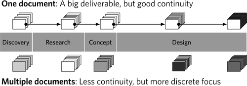
Why one document?
• Maintenance: It’s easy to maintain a single document. With one deliverable, managing dependencies is simpler because you’re not having to create a mechanism for referencing other documents. Instead of pointing to a personas document (and who knows what happened to that document anyway), the single deliverable already includes the personas.
• Context: Instead of having to set context with each new deliverable, the document preserves the “historical record” of the project.
• Focus: You can adjust the contents of the document to preserve focus on what’s important. This is true for the project as a whole, too. Many methodologies became mired in the outputs and not the results. Documents are a by-product of creativity, not the desired outcome.
• Continuity: It can be easy to lose the thread of a project when it’s structured around multiple documents. As the project evolves, the singular document does so in parallel, tracing the series of design decisions.
Of course, creating a single document presumes:
• Flexibility in format: You can let the document grow and change over time.
• One team: Yours is the only team responsible for the content of the document or the outputs of the design process.
• One file owner: You can name one person in charge of pulling everything together.
• One track: Your team is operating on a single stream of work, not dividing up the scope of work.
In choosing the right approach (one document vs. several), consider the benefits and challenges, in Table 8.1.
Table 8.1. Comparing deliverable strategies, using one document throughout the life of a project versus creating several different deliverables.

Creating Multiple Separate Documents
In some cases, multiple documents will be unavoidable or preferable, because of the following:
• Corporate culture: Some organizations have particular ideas about how design documentation should look. In large or bureaucratic companies, format might be dictated on high and the project team has little say in how to communicate design. In most cases, however, the organization is indifferent to the exact format of the deliverable, so I can easily let it grow and change over time. Corporate culture dictates the need for distinct reports and design documents for each activity.
• Multiple contributors: My clients sometimes use multiple vendors on a project, and each vendor is assigned a different activity. If my firm is doing information architecture and interaction design, another vendor may be focused on graphic design, and others may be engaged to do testing and research. The client may handle implementation internally. This array of people and teams can make it challenging to use a single document from beginning to end for the entire project. For my portion of the project, however, that is how we will operate. Project logistics, such as separate funding sources for different aspects of the project, can make it difficult to proceed gracefully from one activity to the next.
• Production logistics: For better or for worse, current technologies operate under the assumption that there is one person who is the final “owner” of the file. Many applications try to simplify the process of integrating content from contributors, but ultimately don’t make it easy for people to be working on different parts of the same document. If Nathan and I are each working on a different part of a deliverable, we’ll break it up but designate one of us to be the “final owner,” the person responsible for integrating all the content.
• Multiple tracks: Large projects will sometimes support multiple tracks of design, each track pursuing a different piece of the pie. Like one team and one owner previously, one track is not essential—there are ways to use a single document on a multitrack project—but it is easier.
These and other circumstances have nuances that will demand different approaches to documentation. In this situation consider taking steps to preserve continuity, such as:
• Establishing documentation standards and universal conventions at the beginning of the project
• Insisting that everyone working on documentation create good and consistent summary pages. These pages will be the easiest way to incorporate key information from one document into another.
What Makes a Good Deliverable
The things that make for a powerful diagram—legibility, relevance, actionability—are the same things that make for a good deliverable. Like diagrams, simplicity in deliverables is paramount.
Good Deliverables Tell Stories
A good deliverable tells a story, and telling a good story is hard. (Seriously, turn on your television in prime time any night of the week and you’re more likely to hit bad storytelling than good.) So, let’s take a good look at what this means in the context of a design project.
Theme
Good stories have a theme, an essence, a “what this story’s about.” It is, in short, a concept that ties ideas together and gives them meaning. Theme has been, well, a major theme in the earlier chapters in this book because it’s a useful mechanism for keeping a diagram, artifact, or conversation focused. Themes provide direction for design, a basis for making design decisions. Can design projects proceed successfully without a theme? Potentially, but experience shows that having a single unifying idea can keep design activities focused.
The design project may have an overall theme, but it’s useful to devise such a focus for the deliverable itself. This is more than just the purpose of the deliverable (to communicate the latest design ideas or to solicit feedback or to facilitate decision-making). A theme for the deliverable constitutes the primary takeaway, the one thing that readers get from reading the document. Some examples:
• The swim against the tide: “This project is fraught with external challenges. Here’s what we’ve been able to accomplish within the established constraints, but here’s why they’re not optimal.”
• The fresh eyes: “This design challenge is very complex, and would benefit from a new perspective. Here’s a new way of thinking about this problem and what insights it yielded.”
• The refactored challenge: “This approach to the design challenge doesn’t accommodate all the requirements, but it does address user needs as described in user research.”
Stating them this explicitly as a planning exercise is good. Stating them this bluntly in the document may challenge team dynamics.
Beginning, middle, and end
A deliverable that tells a story acknowledges what came before. This reference is more than just a mechanism to remind the project team what they just did. References to prior work lend credibility to the current work, normalize the underlying assumptions shared by the project team, and, ultimately, drive the design.
One way to position the most recent work is in contrast to what immediately came before: Version 2 improves upon version 1 in this way. A version history, as such, not only helps people follow the trail of the design process but know what to focus on. With the increasing complexity of projects (in terms of requirements, technical capabilities, quantity of stakeholders, and depth of reach into the organization), a “previously on our show” message reminds people what’s important.
Recent work may also lead into the next set of design activities: A site map sets up wireframing, personas provide context for up flowcharting. The “end” of a deliverable is not just the design punch line, but also how it sets up the next steps.
Conflict, contrast, and comparison
When denied a viewing of the latest commercial flick due to the potential fear factor, my son often asks us, “Why are there scary parts in movies?” At an early age, he learned about drama—it’s what makes stories interesting. In the hopelessly nonfiction, unanimated, explosion-free world of design documentation, we can still use conflict to make an impression on project participants. (And I’m not talking about 3D PowerPoint animations.)
In this case, conflict comes from contrast and comparison. The project plan provides one way to draw comparisons: time. We can compare between the state of the design today and the one previously; between the current design activities and the ones to come. But there are other kinds of contrast a deliverable can use as the basis for a story:
• Different approaches: In short, the deliverable presents two different ways to solve a design problem. It lines up the options side-by-side to highlight the tension between them and make it easy to pick one over the other.
• Conflicting priorities: Even the simplest design problems come with inherent conflicts. With all the different people working on the project, all the different objectives, all the insights from user research, the design team is bound to encounter requirements that conflict. Conflicting requirements call for two different design approaches, or one solution that successfully mediates between the two. There are multiple ways of addressing such conflicts, but regardless of which direction you choose, the document can tee up your approach by illuminating the distinction.
• Ambiguity in requirements: Another kind of conflict is between reality (what you have) and the ideal (what you’d like to have). Positioning the starting point against the ideal can help stakeholders understand the gaps in knowledge. Perhaps you’re trying to fill these gaps through research or brainstorming, or perhaps the gaps in knowledge help explain the state of your design direction or the approach you took to get there.
Tension draws people in. The more you can use these conflicts inherent in the design process as a framework for the document, the more you will engage the project team to participate.
Characters
Stories have characters, the seemingly autonomous actors who, with the right amount of depth and empathy make readers care about them and interested in the story. The stories I’m most attracted to are those whose characters I care about long after the show or movie or book is over. It isn’t the plot lines that linger in my imagination: It’s the definition of the characters—who they are and the decisions they made.
It can be easy to default to thinking of personas (or even project team members) as the characters in your story, but this approach does a disservice to the deliverable.
Can you treat design artifacts as characters? At the simplest level, I’ve seen good art directors name their design concepts. Some of the best names are abstract, evoking the concept without necessarily being an accurate, objective description. (Think “Blizzard” for a design concept in cool colors rather than “Gray and Teal with Rounded Corners.”)
As the artifacts emerge, think of them as distinct personalities, each relating to the theme (the overall design concept) in a different way. Independently, they can’t describe the theme fully: They need each other to explore the theme and overarching concept fully. As their author, you need to ensure that they are believably part of the same universe, making use of the same visual language, resting on the same assumptions, and working toward the same objectives.
Storytelling in design documentation
Therefore, after reading a deliverable, someone who hasn’t been along for the ride should be able to describe:
• What the current state of the project is.
• How the current design decisions relate to previous activities and how they set up the next set of activities.
• What the overall theme of the design project is.
• What the most important design decisions are, and how they relate to the overall theme.
• What the major issues facing the design project are.
Make sure you incorporate content in your deliverable that accomplishes these objectives.
Good Deliverables Encourage Conversation
All designers hope to prepare deliverables that are compelling enough, thoughtful enough, and well-written enough to encourage enthusiastic conversation. Frequently, project parameters (timelines and budget), constraints (requirements), and challenges prevent design teams from achieving this on their documentation. This is as it should be, as the focus for the design team should be on developing the design.
I’m sure there are great design deliverables that stand on their own, products of great minds (and greater budgets and timelines) that yield productive brainstorming sessions. Don’t expect every document on every project to achieve that level of engagement. You’ll drive yourself crazy. Frankly, my assumption these days is that the best conversation must be explicitly encouraged, not simply hoped for.
Why care so much about conversation? The purpose of a deliverable is to advance the project. Like the scene in a movie that shows the ne’er-do-well kids finding a treasure map stuck inside an old library book, the purpose of a deliverable is only to move the plot. If it’s not getting you closer to launching a product, why make it? The next sections offer some techniques to make sure you have something to talk about.
Figure 8.2. A table of contents makes a nice meeting agenda. In this case, I’ve highlighted different sections of the deliverable and assigned them to different times in the meeting.
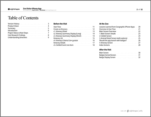
Figure 8.3. Questions embedded in the deliverable make it easy to kick off the conversation.

Table of contents
The value of a table of contents? It makes a great meeting agenda. Nathan introduced me to this technique. Within the first 5 minutes of a meeting, he lingers on the table of contents as a means for establishing the discussion for the next 25 to 55 minutes.
Explicit questions
Lace your deliverable with questions. Also known as the “brute force” approach, by putting questions in your deliverable you:
• Remind yourself of remaining issues to be discussed
• Inspire conversation by feeding participants one half of the dialog
You can put questions:
• Adjacent to the design artifacts about which you have specific questions
• At the beginning of the document, as a way to set the agenda for the meeting (“we need to answer these questions”)
• At the end of the document, as a way to kick off conversation after reviewing the latest iteration of the design
For ideas on the different kinds of questions you might embed in a document, look through the “Presenting…” sections of each of the preceding chapters. The meeting agenda section deals with soliciting feedback and offers different questions related to each artifact. Generally speaking these questions fall into these categories:
• Clarifying the design problem: Any activity after framing the design problem inevitably sheds more light on the design problem. This is one of the frustrating (or perhaps intoxicating) truths about creative endeavors: the more you try to solve a problem, the more you understand it. By the same token, the more you try to define a problem, the harder it will be to solve. Philosophical conundrums aside, your efforts may yield additional questions about the design problem itself.
• Identifying gaps: By “gaps” I’m usually referring to scope: what’s missing in what you’ve designed so far. Does the design adequately address all the different scenarios? Does it accommodate all the requirements? Does it leave out any crucial information?
• Validating the approach: Your questions may try to get at whether your approach is right. This is a superset of the previous questions. Are you solving the right problem? Are you missing anything that renders the design concept “incorrect” in any way?
Decisions
Depending on where you are in the design process, some deliverables may represent crossroads—an opportunity for stakeholders to push the project on one direction or another. Perhaps you’re presenting two design concepts and the project team is responsible for selecting one. Perhaps there are three different aspects of the project and you need the project owner to select one aspect as your focus moving forward.
When positioning decisions, make sure the deliverable:
• Clearly identifies the options: You can go east or west. That’s how explicit the deliverable should be. No doubt your project has nuances that makes such a clear divide challenging, but if you can position it that way at the outset, it will be easier for your stakeholders to weigh in.
• Describes the implications for each option: Choosing one option over the other will have a ripple effect downstream. Preceding chapters have a discussion of implications in the “Presenting…” sections, and the book’s introduction has a framework for describing different kinds of impacts design decisions might have. Use these as a reference for identifying the different impacts of each decision.
• Provides a recommendation: Indicate which option you prefer, and provide a rationale. No doubt some readers will disagree here, but experience shows that my clients (internal and external alike) value my opinion. Recommendations especially make an impact if they have strong justifications behind them.
Good Deliverables Are Actionable
Actionability, another concept I owe to Nathan, is the document’s ability to carry project participants into the next set of activities. Actionable documents are more specific than those with a set of “next steps” at the end. Instead, they position each insight, conclusion, or decision in terms of how it informs the next activity. Strictly speaking, nothing should be in the document that doesn’t explicitly inspire the next set of decisions.
• Deliverables describing research results should provide explicit direction about what the design should or should not do.
• Deliverables establishing a structure for the web site should clearly inventory the range of templates to be designed.
• Deliverables providing functional specifications should provide developers enough information to take the concept to coding.
This is the main reason why artifacts can’t stand on their own. A diagram depicting a site structure, for example, isn’t usually explicit in what such a structure means to the project activities. Therefore, to integrate actionability:
• Use imperative tone: That is, conjugate your verbs as commands, much like the first phrase of each of these bullets does. It may come across as rude, but ultimately your design artifact isn’t trying to make friends by using a casual, breezy tone. The document’s purpose is to move the project along.
• Preface the document with key takeaways: Research documents are ripe opportunities for a one-page preface summarizing everything learned in the user study or usability test. In fact, most documents can benefit from a one-page summary explicitly stating what the team needs to keep in mind as they move forward with the project.
• Frame each page in the document with a purpose or conclusion: Each page in the document is another opportunity to provide direction to the next step in the design process. Research documents are ideal for this: present your findings, but conclude the page with a main takeaway. Set this conclusion apart visually, even providing an icon to highlight the severity, importance, or type of direction it is. But not every page in the document can have a clear call-to-action. Those pages should instead be framed with a purpose: explaining why this page is here, how it contributes to the overall theme and/or purpose of the document. These aren’t conclusions, but instead a summary or gist. If readers read no other annotations on this page, what do they need to know about it?
Documents with purpose
To make deliverables actionable, you must start with a purpose, to know what you’re driving toward. In fact, everything that makes deliverables good (storytelling, conversation, actionability) drives toward this one quality: You must have a reason for making the document.
Even if you create one document that evolves over the course of a project, each draft of that document may have a different purpose, but it has a purpose nonetheless. If you are working on a document and have no idea why, stop and ask yourself:
• How will this move the project forward?
• What do I need from the project team in order to do my next set of tasks?
• Is the document positioned to get me that information?
• What information in this document will people later in the process use?
A purpose is different from a theme:
Table 8.2. Differences between purposes and themes.
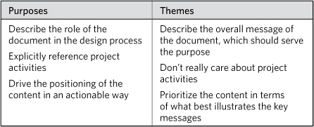
Your document needs both of these.
Anatomy of a Deliverable
Now that you have an idea of what makes for great documentation, let’s make a couple of assumptions about deliverables:
- The Container Assumption:They are a container for artifacts, but they have additional information beyond the artifact itself.
- The Format Assumption:Deliverables are multipage documents on standard-sized pages.
Deliverables can, of course, break both assumptions. You could deliver a single-page poster containing just a site map. (The value of such a deliverable may be questionable, but you can do it.) You could deliver a series of clickable wireframes (format = electronic).
Once you start breaking the assumptions, you’re talking about a different breed of deliverables—no less valuable or meaningful, but definitely beyond the scope of this book.
While these assumptions may be restrictive, they do not enforce a particular level of formality, detail, or any other qualities about the content itself. The takeaway is this: These assumptions identify a framework for telling good stories in the context of web design. Let’s now look at applying that framework in the best possible way.
Title Page and Other Identifying Elements
The first sheet in a deliverable is the title page. The title page should include:
• The name of the client
• The name of the project
• The name of the deliverable
• The names of the authors
• Contact information for the authors
• Date of delivery
• Versioning information
For a good discussion of why putting authors on the document is important, see Tufte.
The first six items are pretty self-explanatory, but versioning a document is fraught with controversy. (Though that may be overstating it.) Versioning can be frustratingly (and unnecessarily) complicated. If yours is a team that likes a complicated versioning system, be sure to collaborate with them at the beginning of the project to establish standards. The most common approach is distinguishing between major changes in the document and minor changes. A version 4.3 means this is the fourth major version of the document and the third iteration of that version. If your team can successfully differentiate between major and minor changes, this may be the approach for you.
Figure 8.4. A deliverable’s cover page with all the essential information.

My team generally uses a single integer for each version. Team members may append other numbers for internal reviews, but the document sheds those when delivered to the client. It’s just as meaningful to say “version 6” as it is to say “version 1.5.”
Figure 8.5. Document metadata appears on every page in the document. The metadata elements should match those appearing on the home page. Of course, individual pages should also include page numbers.
![]()
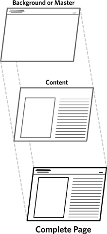
Figure 8.6. Backgrounds or masters are special pages in a file that can be applied to other pages. Elements on a background appear on every page to which they are applied.
One approach to consider is “expiration date.” This idea emerged at a workshop I was teaching. In addition to a version number, the document includes a date when the author knows the information to be obsolete. For projects with even a high-level plan, this should be pretty straightforward: The schedule indicates when the next iteration is due or when the next set of activities starts. A document in its final iteration expires at the end of the project. (It can be tempting to put “Expires: Never” on the final version, but this could lead to problems if the document needs updating later. Instead, better to encourage contacting the document’s author to determine if there’s a newer version than to assume the document is actually up-to-date.)
Document metadata
The elements listed above for the title page are the document metadata. They should be incorporated on every sheet in the document. The one other piece of information to include is the page number.
A couple of tips for document metadata:
• Use backgrounds/masters: Most good diagramming and page layout applications let you establish a “background” that can be applied to certain pages. The background consists of elements that will appear on every page to which it is applied.
• Use document variables: The other useful feature for this endeavor is document variables, which may be inserted on both regular sheets and backgrounds. Typical variables are [page number] or [total pages] or [today’s date]. They are usually accessed from one of the menus in the application. Insert these babies into the document metadata area of your background, and it practically builds itself.
• Create a visual hierarchy: Document metadata is a little story in and of itself. There are meaningful distinctions between the pieces of information. Create a title box for the deliverable that implies these distinctions. A little typographic treatment goes a long way.
Front Matter
To set context, the document should include two sections at the very beginning—a version history and a table of contents. Is this overhead really necessary? Let me make the case and you decide for yourself.
These context-setting elements provide some structure as you tell a story. You can use the table of contents to set the agenda for in-person discussions (as described earlier) and help people looking at the document for the first (or hundredth) time get a lay of the land. The version history helps people focus on what’s changed since their last viewing and provides accountability, demonstrating that you’ve heard feedback.
Version history
I put the version history before the table of contents. In reviewing the document in person, this is a natural progression. We go from “Here’s what’s changed” to “Here are the areas of the document we’ll focus on for this conversation.”
Version histories generally include:
• The version number
• The date of the version
• The author of the new version
• An account of the changes
The first three elements on this list are pretty straightforward. (Though I should mention that you should spell out names in full in the author portion. Initials can be ambiguous. There are two guys on my team with the initials JM. ‘Nuff said.)
Where the variation occurs is in the account of changes to the document. These can range from the very cursory to the painstakingly detailed. As much as I would like this to be a function of the author’s personality, it really depends on who uses the document. Experience shows that developers require the detail to ensure they don’t build something they shouldn’t.
Table 8.3. Version history accounts of document changes can range from the very basic to the very detailed.
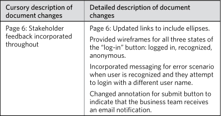
Note that both approaches do indicate the page number for the changes.
Table of contents
If you’re lucky, the application you use to prepare deliverables will create a table of contents for you. (I’m especially lucky because EightShapes Unify has a built-in table of contents format already associated with styles from the document. You should download it!)
Figure 8.7. Document variables in OmniGraffle include X, Y, and Z. These let you do everything from automatic page numbering to incorporating the name of each sheet into the document metadata.
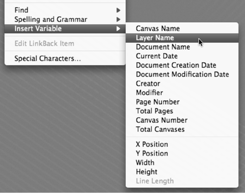
Table of contents features all use the same basic principle, but have been designed somewhat differently from application to application. They depend on your having defined “heading” styles for your deliverable. The template my team uses, in EightShapes Unify, includes Chapters, Pages, and Sub-Pages, along with several variations. The table of contents feature in Adobe InDesign will create a three-level table of contents based on these styles, so long as you used them throughout the document.
Obviously, the table of contents should reflect the structure of the document, and we’ll talk more about that shortly. Suffice it to say that the table of contents is a good diagnostic tool: If it shows a long list of pages without much structure, you should find ways to break up the document. Structure helps preserve the storytelling aspect (three acts anyone?) and provides a useful mechanism for setting the agenda of discussions.
Summary
See this scar on my lower abdomen? I’ll tell you what this scar is from. Picture your intrepid information architect on a two-week sprint to prepare a deliverable, a wireframes deck rife with detailed annotations. They were 10-hour days, trying to hit a deadline so the engineering team could ramp up their development efforts. Your gallant information architect had but one gate to hurdle, an in-depth review with a key business stakeholder. The day of the meeting arrives, two hours set aside to walk through the document and solicit feedback.
For better or worse, the stakeholder hadn’t been present throughout the design process, and your handsome information architect was worried. Worried that they hadn’t accounted for every scenario with the business rules on the configuration page. Worried that he could have done a better job designing the acknowledgement screen. Worried that his hair was kind of sticking up in the back.
The stakeholder arrives five minutes late. Your humble information architect demurely fires up the projector to walk through the deliverable, offering a freshly printed version. He directs the stakeholder to flip to the table of contents. After a brief glance, the stakeholder says, “I’m double booked. I’ve got to get to my other meeting. What do you need from me?”
I tell you this now to save you from scars. If you can’t compact a two-hour conversation into five minutes, you’re in the wrong line of work.
The first content page of your document should:
• Describe the highlights of the document, including any major design decisions or directions.
• Summarize any findings, observations, or conclusions that came out of any analysis work.
• List out the main questions you have for your stakeholders.
You should prepare this page whether your document is 14, 44, or 144 pages.
This will be the hardest page of the document to compose, because every opportunity to summarize, boil down, consolidate, or compact will seem like the murder of a perfectly good idea. Situations like this one happen, as unlikely as an information architect being handsome might seem. You might be in a conversation that veers way off course, or actually get to sit down for two hours with an important stakeholder who has never seen the project before. The “5-minute rule” for deliverables is more than just giving you a way to have important conversations in the space of 300 seconds. It’s a way for you to ensure the integrity of your story and to be sure you can tell important parts.
The summary page needs to be informative (give me the essential information) and actionable (answering the question, now what?). If you’re reducing the type size or increasing the margins to squeeze more in, you’re missing the point.
Introduction and Context
An introduction is kind of a summary, but different. Introductions are not so much “what do you need to know in 5 minutes” but more “here’s what I’m about to tell you.”
Table 8.4. Differences between and introduction and a summary.
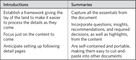
There are two ways to introduce a document: describing the contents of the chapters or describing the position of the document relative to the project plan.
Chapter-based introduction
If your document is divided into chapters, the introduction can summarize what happens in each chapter. In this approach, the introduction provides a lay of the land of the document, a more detailed table of contents.
This approach is useful if the document is presenting a lot of new material, outputs from activities that haven’t involved other people. The introduction doesn’t emphasize the activities as much as the conclusions from that work.
Project-based introduction
Fast-moving projects with highly involved stakeholders might benefit more from a project-based introduction. In this case, the introduction sets context by describing where the team is relative to the project plan, so that the team doesn’t lose the thread of the project. The key messages are “here’s where we are and here’s where we’re going.”
Figure 8.8. A document’s summary page must provide essential information and explicit direction.
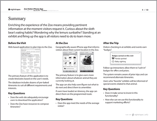
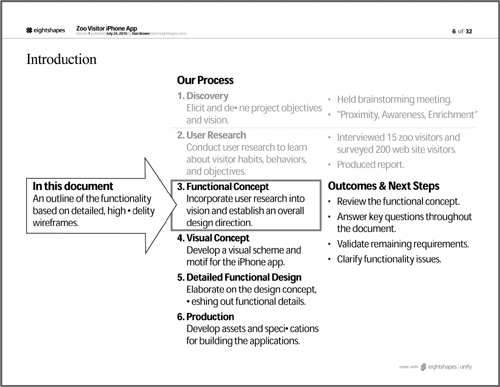
The appropriate picture for this kind of introduction is an abbreviated project schedule. The schedule clearly indicates where you are, relative to activities before and after. The emphasis with this approach is less on the content of the output, per se, and more on how the outputs feed the next set of activities (see Figure 8.9).
Figure 8.9. Project-based introductions position the deliverable relative to the project plan.
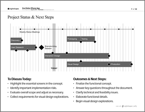
If the project team is familiar with the details of the project schedule, you can use a Gantt chart itself to set the context of the document. Figure 8.10 shows a page from the document with the project schedule, where the project team is, an agenda for the discussion, and the necessary next steps.
Figure 8.10. Using a project schedule to introduce a document sets the context relative to the specific activities and deliverables. It gives you an opportunity to provide status on the progress of the project.
Chapters
Everything we just talked about for the document as a whole you can do for a chapter. A chapter is a document within a document and should be positioned, summarized, and introduced in much the same way just described. The real questions are, what kinds of chapters do you need, and what goes into each chapter?
Structuring your chapters
The bulk of document planning goes into the structure. How should you cut up the content? These decisions, no doubt, must be rooted in the content itself. An outline for a functional specification will not parallel the outline for a research report. In short, there is no one right way to structure the document.
Some tips on preparing the structure:
• Spend more time on this than you think you need to: Give yourself a 15-minute block of time to think through how you want to structure the chapters. If you have a default approach, take a moment to consider the pros and cons of alternate approaches to see if you can find a more effective structure for telling the story.
• Support the theme and purpose: If the theme is, for example, “We face more difficult challenges than anticipated,” consider structuring a document around those challenges.
• Draw a picture, not just an outline: Our document planning sessions involve drawing thumbnails of sheets from the document on a whiteboard. By drawing thumbnails, we can take our structure discussion further, thinking through how we’re going to present information on each page. You could also use stickies to make it easier to move stuff around.
• Collaborate with content contributors to determine the structure: Ideally, you don’t have to do this in a vacuum. If other people on the team are contributing to the document, even a little, ask them to join you for 15 minutes of brainstorming the structure.
• Show the picture to the people who will use the document: As much as I abhor the phrase “content consumer,” it does pretty clearly define the people who care about the document the most: those who will have to use it as part of their work. “Here,” you say in a short conversation with them, “This is what I’m putting together. Can you think of anything else you need? Does the structure of the document make sense?”
• Carve out space for future content: Don’t conceal parts of the outline that don’t yet have flesh. Let them all hang out in their skeletal glory. If you know something’s coming, prepare a space for it in the document. (More on this shortly.)
Letting the structure emerge
A lingering challenge: How to reconcile a document structure with the unpredictable nature of projects? Is it possible to use a single document (as I’ve recommended earlier) with a predetermined structure when design projects are inherently uncertain?
• The vision: Establish a document structure with placeholders for content you know will come. The document is born during a project’s discovery phase, but you know you’ll eventually have site maps and wireframes and usability testing reports. Your ideal approach is to establish an empty chapter for each of these things and fill in the content as it emerges.
• The reality: Projects are completely unpredictable. You don’t know what’s going to happen. I’m not even talking about the project derailing; I’m talking about uncertainty on a smaller scale. Requirements get “de-scoped” or you miss a minor deadline or a new requirement emerges. All of these things make it difficult to follow a structure you put in place weeks or months ago.
• The practice: A table of contents that changes is OK. Establishing a structure at the beginning lets you set expectations with the project team to help them understand the kinds of information that will emerge over the course of the project. Changes to that structure are useful topics of conversation. Highlighting why you had to change the document is meaningful to the project team because it captures important shifts between expected outcomes and actual outcomes.
Chapter cover sheets
Like the introduction for the document as a whole, chapter introductions should provide a lay of the land: What will readers see in the next few pages and what are the main themes addressed?
Earlier, I distinguished between summaries and introductions—two different sheets that serve related but clearly separate purposes. The cover sheet for a chapter more closely aligns with an introduction than it does with a summary, but could still include some clear actions or unsettled questions.
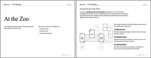
While chapter introductions may require only a bullet list, content in some chapters may lend itself to something more elaborate, as in Figure 8.11, which uses two sheets. The chapter’s cover sheet hits the main messages, and the first sheet describes the content of the chapter.
Figure 8.11. Introducing a chapter on the chapter’s title page by spelling out the major elements of the chapter in a bulleted list. The first sheet in the chapter provides an overview of the chapter’s content.
Next Steps
Design documents don’t have a conclusion, at least not in the way your high school English teacher expected. But these deliverables should still have clean demarcation at the end.
Remember, in composing a document, your job is more like a journalist than a joke-teller. A good design document gets the conclusion out of the way at the beginning, then uses the rest of the document to support it.
Instead your document should end with “next steps,” an account of where to go from here. Your document also started this way, positioning the content as a stepping-stone to lead the project to a subsequent set of activities. Conclude the document in the same way, answering the question, “Now what?”
Next steps are really between you and your project manager, but here are some ideas:
• Validation activities: People need to ensure that the approach, direction, and conclusions described in the document are correct.
• Elaboration activities: People need to take what was established in the document and flesh out details.
• Directional decisions: People need to choose from two or more options presented in the document.
Remember, the best next steps are:
• Accountable: There is a specific person to whom the steps are assigned.
• Measurable and constrained: There is a clear definition of success and the responsible party understands the deadline.
• Specific: The task is clear about what needs to be produced. (Not “additional screens” but “five additional annotated wireframes”).
Next steps and evolving documents
If you’re using a single document throughout the process (rather than creating a new document for each activity) the next steps described at the end of the document will change with each new iteration. Next steps change from one milestone to the next, and so they should in the document.
The nice thing about this approach is that you can annotate the next steps from the previous milestone to account for their disposition. Figure 8.9 incorporates both upcoming next steps and those from previous activities.
The Final Product
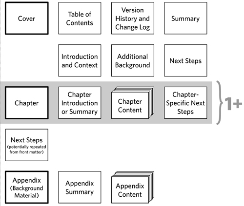
Incorporating all these pieces, Figure 8.12 shows what your structure might look like.
Figure 8.12. The structure of a document. Each row represents a chapter, and the rectangle with the heavier lines shows chapter cover pages. The gray box shows a repeated structure for one or more chapters in your document.
Laying Out Pages
Composing a document is more than just assembling the right structure of pages. It implies creating page layouts that communicate appropriate “plot points” in the story.
My team uses the concept of a document “recipe” to describe both the structure of the document and the specific types of layouts used for each sheet. We refer to a layout as a “page pattern,” founded on the relatively simple idea that most design deliverables consist of the same page layouts over and over again.
The templates included with EightShapes Unify reflect dozens of page patterns for almost any imaginable situation. We add to this library all the time as we devise new ways to communicate complicated ideas. Here are some of the general types:
Pages That Explain
Figure 8.13. Use annotations to elaborate on a design artifact.
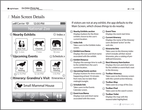
Explanation pages elaborate on the details of a design artifact, using annotations to point out important elements and narrate some detail about it. Annotations consist of a numbered marker on the artifact and a similarly numbered marker next to a description. Typically, these appear with wireframes or screens, but they could be used for more abstract artifacts, too.
This layout is our go-to approach for functional specifications. While it would be nice for our design diagrams to stand on their own, annotations describe details that may not be depicted easily. The format can support a high-level description (aka “light annotation”) that provides an overview of the screen’s behaviors. It can also support a more detailed level of annotations for digging into the complexities of a page.
To help tell the story, annotations may be grouped based on their function or the target area of the design they describe.
Pages That Evaluate
Figure 8.14. Capture critiques as annotations, but also conclude with a strong, actionable takeaway.
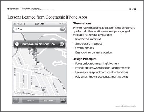
Similar to pages that explain, pages that evaluate provide a critique of a design artifact, usually a screen. You can format the annotations like those in explanation pages, but there may be additional pieces of information to include, like a measure of severity or priority.
These are useful in competitive analyses (see also the upcoming section “Pages That Compare”) or expert reviews, in which you provide some feedback on an existing design based on industry standards and your experience as a designer.
An evaluation should conclude with a key takeaway, providing an insight based on the evaluation.
Pages That Introduce
Figure 8.15. Use distinct regions of the page to provide a short overview of each thing you’re introducing. Tie these things together with a unifying message at the top. Make sure the layout reflects the relationship between the things: distinct approaches, linear progression, and so on.
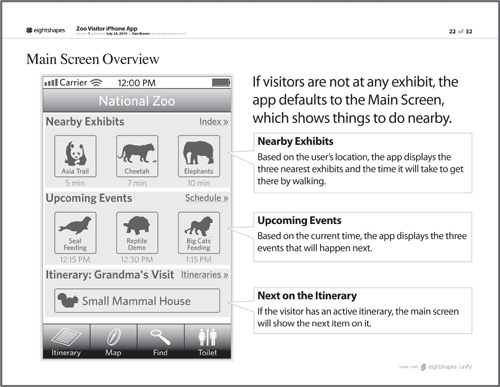
Unlike explanations or evaluations, which elaborate on details, introductions should provide a lay of the land, zooming out to show a wider range of content. An introduction points out highlights, major landmarks. Introductions connect the detailed content to larger themes or messages.
I’ll use a page format like this one for just about any set of concepts that together form a whole but have enough detail to warrant at least one page on their own. Imagine using this page for a rogues’ gallery of personas or storyboarding the four most important pages in a flow.
Pages That Compare
Figure 8.16. Place artifacts side by side to highlight their differences.
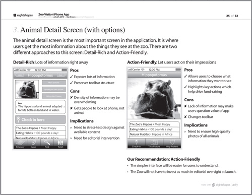
The design process may yield multiple directions. Background research may identify competitors with new approaches. At the very least, it may be relevant to compare the as-is state of the web site with the to-be, to ensure you’ve addressed all the needs. Annotations remain important in these comparisons because they describe the comparison.
These pages are ideal for competitive analyses, which may show more than one way of solving the same design problem. I have also used this layout for usability tests to compare observations made of two different users.
Comparison pages require a strong conclusion: What’s the point of comparing if you don’t gain an insight from it? Whereas explanation pages may set the tone of the design concept by highlighting an overall theme or purpose, comparisons need to highlight a takeaway, answering the question, “So what?”
Pages That Require a Decision
Figure 8.17. Describe the problem and then spell out the options for pages meant to drive a decision.
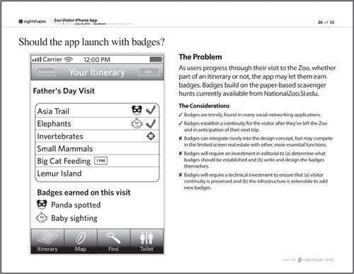
Whereas comparison pages hope to highlight differences in order to gain a particular insight, decision pages pose a question and provide sufficient information to drive toward an answer. A comparison will only focus on differences or similarities, but a decision page will also provide criteria for making a decision.
You may be reluctant to use decision pages. It may feel like your design work should not be subject to a one-page mechanism for deciding upon direction, or that you can’t boil down decision-making criteria to a simple list. That said, the purpose of the deliverable is to move the conversation forward. It should be less a voting ballot and more a means for spelling out the options and the relevant topics of conversation in the context of the decision.
Presenting Deliverables
In each of the previous chapters, I’ve described an approach for presenting individual artifacts. This presumes that the focus of your conversation is a particular aspect of the document.
What if you need to walk through a whole document? The structure established in Diagram Basics (Chapter 2) is appropriate for walking through a whole deliverable. It follows a flow that would follow the structure of the document, if you used the one described earlier. Table 8.5 applies the presentation framework to deliverables.
Table 8.5. Presenting a deliverable follows the same basic framework used throughout the book to structure discussions about design.
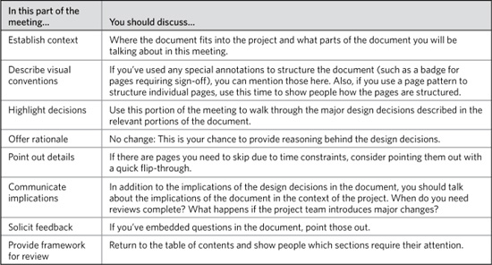
Presenting Deliverables vs. Presenting Artifacts
So, are you presenting a deliverable or presenting an artifact? The book covers both, but which is the “correct” approach? You may be faced with either situation, sometimes both on the same project. If the choice isn’t clear based on the circumstance, use the guidelines in Table 8.6.
Table 8.6. Presenting artifacts or deliverables and artifacts, some situations to consider.

The Deliverable Lifecycle
Deliverables are conceived and born. They mature and eventually go where all good deliverables go, to that great archive hard drive in the sky. (Cloud storage solutions make that metaphor almost literal.) Maybe it’s easy for you to think of your documentation as inanimate, but I just can’t. A cradle-to-grave metaphor persists throughout this section. Bear with me.
The lifecycle of a deliverable—where it is in its maturity—depends on three factors:
• Ratio of content to placeholders: Initial documents contain more placeholders for content than they do actual content. As you replace placeholders with content, the document matures until there are no placeholders left. This is one way to measure the document’s stage in the lifecycle.
• Relationship to project plan: Your ability to add content to a document is directly dependent on the project’s activities. You can’t incorporate findings from a usability study until you’ve conducted the study. Deviations from the project plan don’t need to stunt the growth of the deliverable if the plan is adapting to new circumstances while bringing the team ever closer to the project’s objectives.
• Serving the project objectives: And that brings us to the last criteria by which we can judge a document’s maturity. Is it doing what it set out to do? Does a design specification sufficiently capture the functional details of the product? A usability results report, for example, that doesn’t provide sufficient marching orders to the design team based on the test hasn’t likely reached full maturity.
The stages of the lifecycle described in the following sections are a loose framework based on these criteria. They provide a sense of where you might be and things you can do to help mature the document.
The description of the document lifecycle implies a particular situation or organizational culture. Depending on your situation, it might strike you as antiquated or obsolete, especially in the later stages of the lifecycle.
One observation I made in writing these descriptions is that in modern software engineering methodologies, the deliverable lifecycle is abbreviated. I’d explain this by saying that deliverables in such methods have a very specific, targeted purpose. They play the same role (communication, alignment, etc.), but they have a significantly shorter half-life. Conflicts that might arise in the very late stages of a more “old-school” process do not arise in modern development practices. In these methodologies, questions about whether to keep a document up-to-date become irrelevant because the document is more disposable.
Conception: Document Development
In the very beginning stages of a document, things are pretty messy, not unlike other forms of conception. This process works best in front of a whiteboard with the people who will be collaborating with you on the document. During the conception of the document, you’re identifying the overall structure (Table of Contents) and (if this is how you operate) the page layouts you’ll use in each section. The whiteboard you end up with might look like the one in Figure 8.18.
Figure 8.18. Conceiving a new document is less intimate but just as messy as other types of conception. In the results of this brainstorming session, the team worked together to establish the structure of the document. While this sketch may look like a mess, the participants have a good idea of what the structure of the document needs to be and what each page of the document should look like.
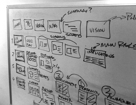
This is the shortest phase, perhaps lasting only a few hours as you work with your project team to sketch out the basics of the document and then translate that outline to your page layout application. At this stage, the document is pretty rudimentary, unlikely to have much, if any, content.
I’ll tell you right now, I have no idea how to react when someone tells me the sex of their baby. Congratulations are due in either case, so “That’s awesome” seems somewhat disingenuous, but whatever. On the flip side, if a team member shows me a nascent deliverable, I can provide all kinds of feedback. Here are the things I look for in evaluating a team member’s initial document:
• Is the document purpose clearly articulated?
• Does the structure support the purpose?
• Is there a clear place for next steps, and are they specified early in the document as well as at the end?
• Will the structure of the chapters make a natural progression?
• Are the layouts suitable for the purpose?
• Are there opportunities to consolidate pages?
• Is there a need to separate out pages?
• Does each new chapter or idea have a good introductory page or two?
Birth: The First Presentation
When you show the document for the first time, it should have more content than the initial scaffold developed in the conception phase. There may not be enough content for the document to stand on its own, but the main messages and ideas have been incorporated.
When you’re looking at the initial version of a new document, a few things should jump out:
• Potential: Even though the document can go in lots of different directions (and you’ll be proud regardless of which direction it goes in, unless it becomes an actor), it has placeholders for content to come. These placeholders will in part evoke an enormous amount of work required to fill them, but should also communicate opportunity. You’re building something new here, and you know what you need to do—what information to provide—to make it successful.
• Alignment with plan: Those placeholders represent opportunity, but they should also align to upcoming activities. Looking at a nascent document, still limited in its content, I should still be able to picture the project plan. A document alone should let me know where the project is going.
• Illuminated challenges, constraints, and parameters: As the story starts to shape up on paper, you’ll uncover potential obstacles that lie between you and your objectives. The mere act of telling the story, even in rudimentary form, shines a brighter light on the project. This light brings greater insight into the things that constrain the project and present challenges, but also helps you refine the ideas within the story.
You might detour in your very first presentation of a document to address these three things. Putting something down on paper, even if it’s the physical manifestation of your anticipated design process, always yields insights you hadn’t considered previously. Incorporate some of these thoughts into the first, second, or third parts of the basic meeting framework (see the previous section “Presenting Deliverables”).
Puberty: Still Some Maturing to Do
A document is considered pubescent if chunks of content remain missing. Enough of the story is in place to allow for sufficient momentum on the project, to propel you from one set of activities to the next. The document captures insights and conclusions from your initial set of activities, such that the project team can react, validate, clarify, or decide as necessary to move you along to the next set.
Documents can spend a long time in this stage: Placeholders you anticipated filling in eventually remain untouched. You might quietly eliminate them. (Documents, unlike humans, don’t ever regret the road not traveled.) If you don’t feel right making the executive decision to do so, you can highlight these portions of the document in the Solicit Feedback section of your meeting. In evaluating these sections, you (and potentially others) should ask the following questions:
• Are they connected to future activities?
• Do other parts of the document now address the same need?
• Can they be consolidated or refactored to reflect future activities better?
• Can key points from them be integrated into existing sections?
Maturity: All Content Present
A fully mature document is one in which all the placeholders have been replaced by actual content. This isn’t to say that there isn’t room for updates or even additions. A document is mature when it matches the initial vision of what it’s meant to do.
The preparation of each iteration of the document has been the by-product of the team’s activities. A mature document might still grow and change depending on those activities, but it’s unlikely there’s much left in the project plan that can contribute to the document.
Retiring portions of the document
One of the risks with creating a single document in the course of a project is that the utility of content may recede over the course of a project.
Imagine your document structure starts with a chapter summarizing the results of user research. You might have a dozen pages, describing the type of research and providing insights into the observations and subsequent analysis. As you move into detailed design activities, keeping this information in the document (a) weighs it down with unnecessary pages (and megabytes) and (b) distracts from the new content.
In short, as the project progresses, outputs from prior activities may be less relevant. This is where introduction pages are especially useful. Your introduction page should include a reasonable summary of the key takeaways from all your project activities. By reducing the content from that section to just that introductory page, you can preserve the spirit and value of the activity without bogging down the document with obsolete details.
End-of-Life: Shelving the Document
The death of design documents is quiet and unassuming. In short, people on the team just stop opening them. The project activities require your attention elsewhere. The demand for their content diminishes as deadlines related to the deliverable pass and the team moves onto other things.
But, how does that old quote go? “Reports of my death have been greatly exaggerated.” This is especially true for deliverables.
Documents you perceive to be casketed might be, in reality, still making the rounds. Just because the design process has concluded and there’s nothing more you can do on a design document doesn’t mean that its life is over. On the contrary, other parts of the team (engineering, quality control, and maybe even customer service or training) refer to them constantly. The mettle of a deliverable’s utility is put to the truest test as people use design documentation not just as a tool for implementation, but for all the activities that come with it and after it as well.
Here’s what might happen long after you turn in the “final version” of the document:
• Clarification: The caller ID isn’t someone you recognize or maybe you get an email and the “from” field contains a vaguely familiar name. Like someone you might have met a long time ago at a company function. Your tech lead mentions this name sometimes. Oh, right, that’s the QA guy. He’s using your document. Actually using it. Like in his job. Of course, he’s asking you about some pretty obvious scenarios you left out.
• Update: Same guy. He’s now translating your designs into test scenarios. There’s a pretty egregious error on page 6, something with the wireframe annotations not reflecting the correct values in a drop-down. He’s asking that you update the document to correct the error. As you hem and haw, he reminds you that a QA team of five people is using this as the document of record to test the system in the development environment.
• Kicking off the next project: The quality assurance team found a handful of bugs, nothing to prevent the first version from launching, but things that need to get integrated into the next release. Also, feedback from the business unit’s customers has been rolling in, and they have a wish list a mile long. The product manager gives you a call, “I’ve been reviewing the design document and making notes about things we need to upgrade for the next release.”
Maybe these scenarios read as a little “old school.” Most modern engineering methodologies short-circuit the old-fashioned, endless timelines of software development.
Maintenance: Keeping It Healthy
The topic of document maintenance comes up a lot at workshops I teach on design deliverables. The question isn’t so much about keeping a document up-to-date during the design process: Every team has its own way of sharing files and scheduling updates. (Yours, too, right?) Most people are asking about after the death of the document.
If a design document serves as the document of record for what the product is supposed to be, you might be on the hook for keeping it up-to-date in these circumstances:
• Changes in design during implementation: The very act of implementing something changes the design. Nothing created looks as it does on paper.
• Insufficient documentation during implementation: Later in the process (as in the QA activities described earlier), people working on the project may identify places where the documentation does not provide enough or the right kinds of information.
• Updates in production: Small bug fixes and minor upgrades can cause a discrepancy between what’s in production and what’s documented.
Are you on the hook for keeping the document up-to-date? The best advice is this: Don’t ask this question in the same moment someone is demanding updates to the document. Instead, integrate this topic into your kick-off meetings. You might ask questions like:
• My deadline is May 30, but the product won’t launch until August. Who will make use of the documents between now and then?
• Who is responsible for fielding questions from these people after May 30?
• What is the expectation for keeping this document up-to-date during implementation? If the project team identifies any problems with the document, can these be addressed through an addendum or do we need to create a new version of the document?
• After the product launches in August, who will be responsible for accounting for discrepancies between what’s in production and what’s documented?
• After the product launches in August, what will become of the document? Will it be used as the basis for subsequent releases for the product?
The Future of Deliverables
The beginning of this chapter states explicit assumptions about the definition of a deliverable. In light of newer trends in design methodologies, these assumptions start to seem antiquated. But, as of this writing, I’m still working on documents delivered as PDFs and laid out on standard-sized pages. Sometimes we even print them out.
The word “deliverable” implies only that you create something to be delivered to someone else. Format and style are not inherent properties in what we call our work product, and no doubt there’s room to evolve. Design teams that remain mired in old habits will struggle to keep up. Even simple adaptations of existing deliverable frameworks may not be enough because ultimately documentation is a function of four things:
• The product: The documentation should do a good job of describing the actual thing you’re designing.
• The people: The design team, the development team, and all the other people who have to collaborate to make a product real must buy into the approach for capturing the plans for the web site. Blueprints remain useful to architects and contractors alike because the common language works for both groups.
• Organizational context: Deliverables are part of a larger ecosystem defined not just by the project team, but by the corporate environment. Degrees of formality, integrity, accountability, and history all come from the organization and establish a tone for the deliverables themselves.
• Methodological trends: The way we structure design activities will impact the by-products of those activities. Longer timelines, broader scopes, and multidisciplinary contributions yield one type of document, while quicker burns with narrow objectives yield another.
“Deliverable,” however, does imply certain limitations. This label, as well as “documentation,” suggest both a one-way-ness and finality. Deliverables are something we send along. In practice, we discuss them, collaborate on them, and let them morph with the project’s progress, but you wouldn’t get this from the name.
Maybe we should start calling them “shareables.”
Our obligation as designers is not to the deliverable, but to the product. We are accountable only to the product’s user. But the path to get there is filled with dozens of other people who may have similar objectives with differing agendas. Deliverables are tools to help us navigate that landscape. Our responsibility is to communicate design ideas and capture the details of a design concept in the most frictionless way possible.
Exercises
- Reflect on a recent project, picking a deliverable from the project and plotting on the graph from Figure 8.1. How long did you spend conceiving the deliverable? How many iterations did it go through? What happened to the document? Is it still around?
- Imagine you were creating one document for a recent project (instead of, perhaps, many). Write a table of contents for the single deliverable, accounting for both initial and future project activities. Make the table of contents as detailed as possible, defining what goes into each chapter. As an exercise, avoid structuring the chapters based on the project plan. Imagine you were structuring the chapters around different aspects of the user experience. Try to use real people as the target audience for the document, but if you can’t, imagine the document’s readers. Consider their role and personality as you structure the document.
- For each entry in the table of contents from exercise 2, assign a page pattern from the “Laying Out Pages” section. There are six patterns to choose from. Consider what you are saying for each entry in the table of contents and identify the most appropriate page layout. Create thumbnails representing each page layout and put together a diagram showing the structure of the document. Walk colleagues or your study group through the diagram and solicit feedback on the structure of the document. Was there content they were expecting to see? Does the story make sense? Do they think the structure will be effective in communicating with the imagined target audience?

